Tag: wordpress

  • Creative Cow Videos

    Creative Cow Videos

    Overview

    Creative Cow Videos is a video production company that designs, shoots, and edits promotional content for businesses of all sizes. From brand stories to social media clips, they help companies stand out through engaging, high-quality video marketing.

    Brief

    The client wanted a website that matched the personality of their brand—playful, creative, and approachable—while also delivering valuable, educational content for visitors curious about using video for their business. The goal was to find the balance between fun and informative.
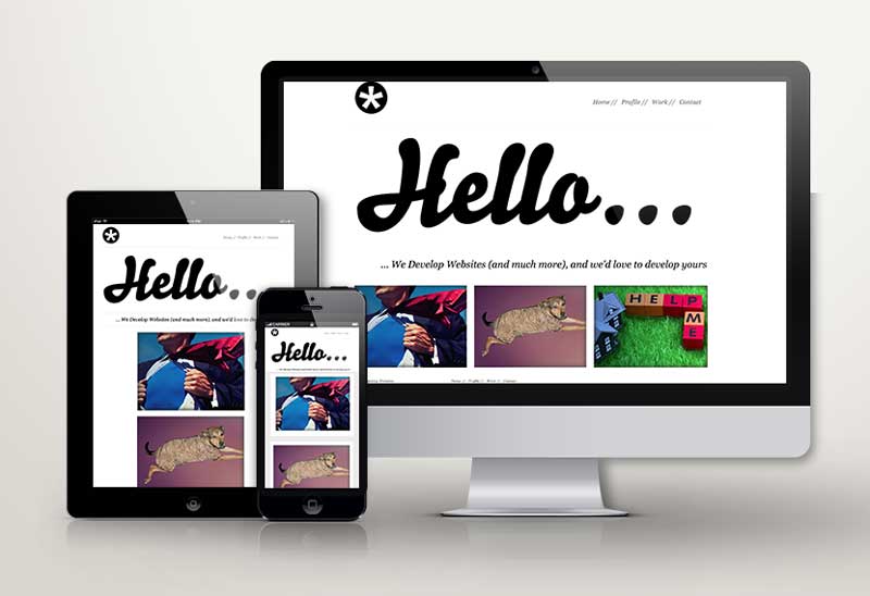
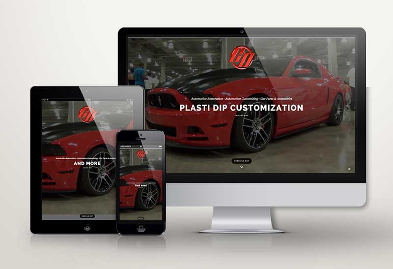
    Work

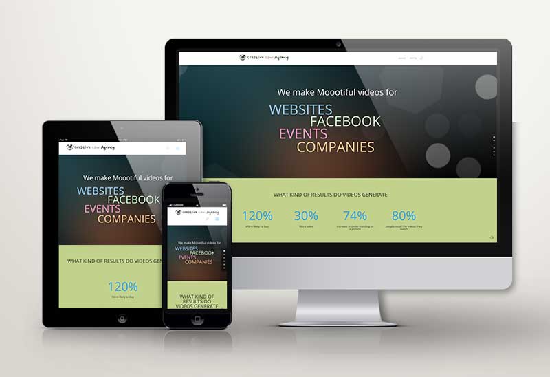
    We developed a clean, colorful website with a light-hearted tone and strong visual appeal. The design is simple and easy to navigate, with playful branding that reflects the name “Creative Cow” without sacrificing professionalism. We incorporated sample videos throughout the site to demonstrate the different types of video content Creative Cow produces—brand overviews, testimonial videos, product features, and more. Each section includes clear, helpful explanations of how businesses can benefit from video, turning the website into both a portfolio and an educational resource.

    Results

    The new site captures the unique voice of Creative Cow Videos while clearly communicating the value of their services. It’s fun, informative, and built to convert curious visitors into confident clients.

  • We Develop Websites

    We Develop Websites

    Overview

    We Develop Websites is a professional HTML website developer focused on building high-quality, custom-coded websites. With a passion for clean design and functional code, the client wanted a site that showcased their skills in a visually appealing and modern way.

    Brief

    The goal was to create a sleek, elegant website that not only looked great but also demonstrated the client’s capabilities as a front-end developer. The site needed to be minimal yet powerful, putting the focus on project visuals and user experience.

    Work

    We designed a bold, modern site that uses generous white space to give each project room to breathe. The layout is clean and intuitive, allowing visitors to easily browse and appreciate the developer’s portfolio. We focused on visual clarity, smooth transitions, and polished typography to create a professional, confident feel. Project pages were built to highlight key features and functionality while letting the design speak for itself.

    Results

    The final product is a crisp, elegant website that positions We Develop Websites as a high-end, detail-oriented developer. It serves as both a portfolio and a statement of design philosophy—clean, modern, and built to impress.

  • SingleMoms101

    SingleMoms101

    Overview

    SingleMoms101 is a heartfelt and creative blog created by two American single moms who wanted a space to share their stories, connect with others, and empower fellow single mothers. It’s a platform for real talk, humor, support, and inspiration—built by and for women navigating motherhood solo.

    Brief

    The founders wanted a visual identity that felt personal, fun, and full of life—just like the tone of their blog. The brand needed to reflect their unique voice while appealing to a community of strong, independent women. The creative direction called for a playful pink color palette, approachable typography, and friendly illustrations to use across print and digital channels.

    Work

    We collaborated closely with the founders to design a complete visual system—from the logo and color palette to fonts and layout styling. The result is a bright, inviting brand identity that captures the sense of fun, resilience, and creativity at the heart of SingleMoms101. The soft pinks, bold script typography, and hand-drawn illustrations all come together to form a cohesive look that works beautifully on both print materials and the blog itself.

    Results

    SingleMoms101 now has a charming and memorable brand that reflects its mission and message—and creates a welcoming space for its growing community.

  • Managentum

    Managentum

    Overview

    Managentum is a high-level staffing and executive branding firm that specializes in helping senior leaders elevate their personal brand while placing them in top-tier roles. The company also partners with businesses in search of executive talent or consulting services, delivering strategy, professionalism, and results.

    Brief

    Managentum needed a complete rebranding effort—both to reflect the sophisticated services they offer and to resonate with two key audiences: senior executives looking for their next move, and organizations seeking trusted leadership solutions.

    Work

    We began by creating the logo with a clean, modern look using neutral, corporate-friendly colors to appeal to a professional audience. The new website was built with a contemporary, flat, layered design that is fully mobile-friendly and easy to navigate. Individual pages were developed for each user persona—executives, companies, and consultants—to ensure the experience is personalized and relevant. The site also includes advanced features like a membership portal and event management tools. To support offline marketing, we created cohesive print materials including business cards and brochures. Our ongoing retainer includes SEO, social media content creation and delivery, and strategic marketing support.

    Results

    Managentum now has a sophisticated, user-focused brand presence that communicates trust and expertise—positioning them as a leading partner in executive placement and branding.

  • Jen Sall

    Jen Sall


    Overview

    Jen Sall is a dynamic model and actor navigating the nonstop world of auditions and creative gigs. In an industry where first impressions are everything, having a bold and polished online presence is more important than ever. Rage Agency was brought in to help make Jen’s personality and talent shine online.

    Brief

    Jen needed a website and video reel that truly captured her larger-than-life energy, professionalism, and range. The goal was to create a digital presence that stood out, felt authentic, and showcased her work in a fun, bold, and visually engaging way.

    Work

    We designed a big, bold website that reflects Jen’s vibrant spirit. High-quality images take center stage, and the layout puts her personality front and center. Her portfolio includes a playful mix of recent headshots, modeling images, and behind-the-scenes moments. The centerpiece of the site is a dynamic video reel—a fast-paced montage of clips from her various film projects, cut together to highlight her versatility, charisma, and acting range.

    Results

    Jen’s new website and reel not only showcase her talent—they amplify her brand. She now has an online platform that reflects her energy, opens doors, and helps casting directors see what she’s capable of at a glance.


  • Chicago Dips

    Chicago Dips

    Overview

    Chicago Dips is a custom auto exterior company that specializes in using Plasti Dip to transform the look of cars—offering a stylish, affordable alternative to traditional paint or wraps. With a millennial-focused audience, the brand is all about color, creativity, and standing out on the road.

    Brief

    Chicago Dips needed a website that reflected the loud, fun, and fearless energy of its brand. The goal was to showcase their wild portfolio with a bold, in-your-face design that instantly grabs attention and gets people excited about customizing their ride.

    Work

    We built a high-impact, full-screen experience that leans heavily on vivid visuals and bright colors. Full-screen videos and photos dominate the layout, allowing Chicago Dips’ custom car work to speak for itself. The site acts as a rolling portfolio, filled with energy and edge. To complete the brand, we created a comic-inspired logo—drawing influence from the look and feel of classic Marvel comics—to add attitude, flair, and instant visual recognition.

    Results

    The new website and brand identity are bold, engaging, and impossible to ignore—just like the cars Chicago Dips creates. It’s a site that not only reflects the brand’s personality but helps drive interest and bookings from a style-hungry audience.

  • Jeff Pointec

    Jeff Pointec

    Overview

    Jeff Pointec is a real estate investor and entrepreneur known for his strategic thinking and bold approach to urban investment. He wanted a personal brand that reflects his growth-minded philosophy and positions him as a real estate mogul with serious presence in the marketplace.

    Brief

    The goal was to create a website that branded Jeff as a sophisticated and powerful figure in real estate—not just another investor. Rather than focusing on homes or properties, the brand needed to convey confidence, leadership, and success through a more metropolitan lens.

    Work

    We developed a sleek, single-page website with a strong, big-city aesthetic. Unlike many in the real estate space who feature houses and suburban landscapes, Jeff’s site leans into urban imagery to evoke scale and strength. The design is modern, clean, and subtly influenced by autumn tones—creating a calm, confident feel. A muted color palette was used to keep the look refined and elegant. The site was built using a responsive WordPress theme, ensuring accessibility and great performance across all devices.

    Results

    Jeff Pointec now has a polished digital presence that sets him apart from typical real estate competitors. The site reinforces his image as a savvy urban investor and positions him for continued growth and visibility.

  • Unitec Recycling

    Unitec Recycling


    Overview

    Unitec Recycling is a Chicago-based electronics recycling company committed to handling e-waste in a safe, ethical, and environmentally responsible way. Their mission is to promote sustainability through proper disposal and reuse of electronic devices.

    Brief

    Unitec needed a brand and website that reflected the company’s values—responsibility, trust, and environmental care. The digital presence had to clearly communicate their ethical approach to recycling, while appealing to both corporate and individual clients seeking sustainable solutions.

    Work

    Rage Agency created a clean, modern brand identity centered on sustainability and trust. We used a green-forward color palette to signal Unitec’s environmental commitment, supported by simple, straightforward messaging that communicates what they do and why it matters. The website was built using a responsive WordPress theme, ensuring it looks and functions beautifully on all devices. Content focused on transparency, ease of service, and the importance of ethical recycling practices.

    Results

    Unitec Recycling now has a professional, easy-to-navigate website that matches the values of their business. The updated branding and messaging help build credibility and encourage responsible recycling among customers—supporting Unitec’s mission to reduce e-waste and promote a cleaner, greener future.

  • Transform For Growth

    Transform For Growth


    Overview

    Transform for Growth is a business consultancy that helps organizations embrace change and evolve into stronger, more competitive players in the marketplace. Their mission is to guide companies through transformation by turning challenges into opportunities for growth and innovation.

    Brief

    The business had strong messaging and a clear value proposition—but its digital presence didn’t reflect that strength. The website and logo were not visually engaging and didn’t deliver the professional polish needed to attract executive-level clients. The business owner turned to Rage Agency to help create a more compelling and client-friendly digital experience.

    Work

    We collaborated closely with the client to create a clean, one-page website focused on answering the key questions most business owners ask when seeking help with transformation. The site is easy to navigate, visually appealing, and sharply aligned with the brand’s core messaging. We also reworked the existing logo, simplifying it by removing unnecessary flourishes and restoring its original, powerful design concept—making it more impactful and versatile across digital platforms.

    Results

    The refreshed website and logo bring new energy and clarity to the Transform for Growth brand. The updated digital presence now communicates professionalism, purpose, and trust—making it easier for prospects to engage and take the next step.

  • Doggy Hairnets

    Doggy Hairnets

    Overview

    DoggyHairnets is a unique and playful product line of dog clothes designed to trap shedding hair before it spreads all over your home. The brand mixes humor with practicality—and they wanted a commercial that would do the same.

    Brief

    DoggyHairnets came to Rage Agency to create a fun, quirky national TV commercial. Instead of a simple product demo, they wanted something with a storyline that would grab attention and stick in viewers’ minds.

    Work

    We developed a humorous, plot-driven script, produced custom props, and directed a full-scale shoot. The commercial was fun, memorable, and—most importantly—effective. (And yes, no animals were harmed in the making!) The commercial’s success led to Rage Agency being hired as agency of record. From there, we gave the brand a full refresh: a bold new logo, a redesigned eCommerce website, custom product photography and videos, and a social media marketing plan that keeps the brand top-of-mind (and in feeds).

    Results

    DoggyHairnets went from a clever idea to a nationally recognized brand. The new digital presence, paired with strategic content and marketing, helped increase visibility, build loyalty, and grow sales—all with the same playful spirit that makes the product unforgettable.