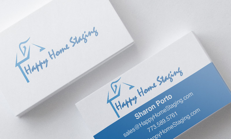
Tag: website

  • Happy Home Staging

    Happy Home Staging

    Overview

    Happy Home Staging is a professional home staging, interior design, and home organization business that helps homeowners and real estate agents present properties at their very best. With an eye for detail and a talent for transformation, they turn everyday spaces into beautiful, market-ready homes.

    Brief

    The client needed a digital presence that reflected the calm, organized, and inviting nature of their services. The website had to be clean, easy to navigate, and visually aligned with the elegance and simplicity that Happy Home Staging brings to every project.

    Work

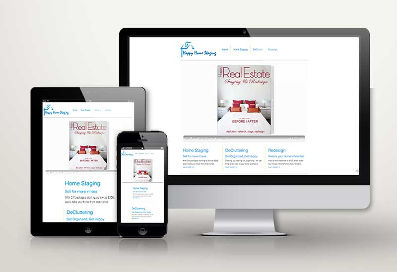
    We created a sleek, modern website with a minimalist design that allows the work to speak for itself. The layout is intuitive and welcoming, guiding visitors through the different services—staging, design, and home reorganization—while using imagery that inspires confidence and action. The overall feel is elegant yet warm, matching the client’s aesthetic and professional tone. Supporting materials, including branded marketing collateral and messaging, were developed to reinforce the website’s polished presentation.

    Results

    Happy Home Staging now has a refined, professional online presence that reflects their expertise and style. The website helps build trust with potential clients and serves as a beautiful showcase of their transformational work.

  • VizDisplays

    VizDisplays

    Overview

    VizDisplays is a digital signage company specializing in innovative display solutions for retail environments and other business spaces, with a strong focus on rear projection systems. Their technology-driven approach helps clients create dynamic, eye-catching visual experiences that engage customers and enhance their brand presence.

    Brief

    The client wanted a website that clearly communicated their technical capabilities and showcased the range of solutions they offer. The goal was to position VizDisplays as a cutting-edge provider in the digital signage space, while also making the information accessible to potential clients unfamiliar with the technology.

    Work

    We designed a responsive WordPress website that is both visually sleek and content-rich. The layout makes it easy for visitors to explore VizDisplays’ services, with dedicated sections highlighting rear projection systems, installation processes, and past project examples. The content is clear and structured to help visitors understand both the value and function of the technology. In addition, we implemented SEO best practices to ensure the site performs well in search results. Supporting materials, including downloadable specs and product visuals, were also created to assist in the sales and consultation process.

    Results

    VizDisplays now has a modern, informative digital presence that reflects their technical expertise and supports ongoing business growth through improved visibility and lead generation.

  • We Make Memories

    We Make Memories

    Overview

    We Make Memories is a heartfelt business that helps individuals organize, preserve, and transform their personal digital media—like photos, videos, and scanned documents—into meaningful keepsakes. Whether it’s a family video montage, a digital photo album, or a memorial tribute, the focus is on turning everyday digital clutter into lasting memories.

    Brief

    The client wanted a website that clearly explained their service in a way that was simple, emotionally resonant, and easy to navigate. The goal was to make visitors feel comfortable and inspired to take the next step in preserving their memories.

    Work

    We designed a clean, horizontal-layered website with a responsive layout that works beautifully across devices. The visual approach is soft and inviting, allowing the service and message to shine without distraction. The content walks users through the process step-by-step—making it easy to understand how the service works and what kind of keepsakes can be created. The layout helps visitors feel guided, not overwhelmed, and encourages connection and trust.

    Results

    The finished website is simple, elegant, and purpose-driven. It communicates the emotional value of the service while making it easy for customers to get started on turning their digital moments into treasured keepsakes.

  • Creative Cow Videos

    Creative Cow Videos

    Overview

    Creative Cow Videos is a video production company that designs, shoots, and edits promotional content for businesses of all sizes. From brand stories to social media clips, they help companies stand out through engaging, high-quality video marketing.

    Brief

    The client wanted a website that matched the personality of their brand—playful, creative, and approachable—while also delivering valuable, educational content for visitors curious about using video for their business. The goal was to find the balance between fun and informative.

    Work

    We developed a clean, colorful website with a light-hearted tone and strong visual appeal. The design is simple and easy to navigate, with playful branding that reflects the name “Creative Cow” without sacrificing professionalism. We incorporated sample videos throughout the site to demonstrate the different types of video content Creative Cow produces—brand overviews, testimonial videos, product features, and more. Each section includes clear, helpful explanations of how businesses can benefit from video, turning the website into both a portfolio and an educational resource.

    Results

    The new site captures the unique voice of Creative Cow Videos while clearly communicating the value of their services. It’s fun, informative, and built to convert curious visitors into confident clients.

  • We Develop Websites

    We Develop Websites

    Overview

    We Develop Websites is a professional HTML website developer focused on building high-quality, custom-coded websites. With a passion for clean design and functional code, the client wanted a site that showcased their skills in a visually appealing and modern way.

    Brief

    The goal was to create a sleek, elegant website that not only looked great but also demonstrated the client’s capabilities as a front-end developer. The site needed to be minimal yet powerful, putting the focus on project visuals and user experience.

    Work

    We designed a bold, modern site that uses generous white space to give each project room to breathe. The layout is clean and intuitive, allowing visitors to easily browse and appreciate the developer’s portfolio. We focused on visual clarity, smooth transitions, and polished typography to create a professional, confident feel. Project pages were built to highlight key features and functionality while letting the design speak for itself.

    Results

    The final product is a crisp, elegant website that positions We Develop Websites as a high-end, detail-oriented developer. It serves as both a portfolio and a statement of design philosophy—clean, modern, and built to impress.

  • SingleMoms101

    SingleMoms101

    Overview

    SingleMoms101 is a heartfelt and creative blog created by two American single moms who wanted a space to share their stories, connect with others, and empower fellow single mothers. It’s a platform for real talk, humor, support, and inspiration—built by and for women navigating motherhood solo.

    Brief

    The founders wanted a visual identity that felt personal, fun, and full of life—just like the tone of their blog. The brand needed to reflect their unique voice while appealing to a community of strong, independent women. The creative direction called for a playful pink color palette, approachable typography, and friendly illustrations to use across print and digital channels.

    Work

    We collaborated closely with the founders to design a complete visual system—from the logo and color palette to fonts and layout styling. The result is a bright, inviting brand identity that captures the sense of fun, resilience, and creativity at the heart of SingleMoms101. The soft pinks, bold script typography, and hand-drawn illustrations all come together to form a cohesive look that works beautifully on both print materials and the blog itself.

    Results

    SingleMoms101 now has a charming and memorable brand that reflects its mission and message—and creates a welcoming space for its growing community.

  • Managentum

    Managentum

    Overview

    Managentum is a high-level staffing and executive branding firm that specializes in helping senior leaders elevate their personal brand while placing them in top-tier roles. The company also partners with businesses in search of executive talent or consulting services, delivering strategy, professionalism, and results.

    Brief

    Managentum needed a complete rebranding effort—both to reflect the sophisticated services they offer and to resonate with two key audiences: senior executives looking for their next move, and organizations seeking trusted leadership solutions.

    Work

    We began by creating the logo with a clean, modern look using neutral, corporate-friendly colors to appeal to a professional audience. The new website was built with a contemporary, flat, layered design that is fully mobile-friendly and easy to navigate. Individual pages were developed for each user persona—executives, companies, and consultants—to ensure the experience is personalized and relevant. The site also includes advanced features like a membership portal and event management tools. To support offline marketing, we created cohesive print materials including business cards and brochures. Our ongoing retainer includes SEO, social media content creation and delivery, and strategic marketing support.

    Results

    Managentum now has a sophisticated, user-focused brand presence that communicates trust and expertise—positioning them as a leading partner in executive placement and branding.

  • Jen Sall

    Jen Sall


    Overview

    Jen Sall is a dynamic model and actor navigating the nonstop world of auditions and creative gigs. In an industry where first impressions are everything, having a bold and polished online presence is more important than ever. Rage Agency was brought in to help make Jen’s personality and talent shine online.

    Brief

    Jen needed a website and video reel that truly captured her larger-than-life energy, professionalism, and range. The goal was to create a digital presence that stood out, felt authentic, and showcased her work in a fun, bold, and visually engaging way.

    Work

    We designed a big, bold website that reflects Jen’s vibrant spirit. High-quality images take center stage, and the layout puts her personality front and center. Her portfolio includes a playful mix of recent headshots, modeling images, and behind-the-scenes moments. The centerpiece of the site is a dynamic video reel—a fast-paced montage of clips from her various film projects, cut together to highlight her versatility, charisma, and acting range.

    Results

    Jen’s new website and reel not only showcase her talent—they amplify her brand. She now has an online platform that reflects her energy, opens doors, and helps casting directors see what she’s capable of at a glance.


  • Chicago Dips

    Chicago Dips

    Overview

    Chicago Dips is a custom auto exterior company that specializes in using Plasti Dip to transform the look of cars—offering a stylish, affordable alternative to traditional paint or wraps. With a millennial-focused audience, the brand is all about color, creativity, and standing out on the road.

    Brief

    Chicago Dips needed a website that reflected the loud, fun, and fearless energy of its brand. The goal was to showcase their wild portfolio with a bold, in-your-face design that instantly grabs attention and gets people excited about customizing their ride.

    Work

    We built a high-impact, full-screen experience that leans heavily on vivid visuals and bright colors. Full-screen videos and photos dominate the layout, allowing Chicago Dips’ custom car work to speak for itself. The site acts as a rolling portfolio, filled with energy and edge. To complete the brand, we created a comic-inspired logo—drawing influence from the look and feel of classic Marvel comics—to add attitude, flair, and instant visual recognition.

    Results

    The new website and brand identity are bold, engaging, and impossible to ignore—just like the cars Chicago Dips creates. It’s a site that not only reflects the brand’s personality but helps drive interest and bookings from a style-hungry audience.

  • Jeff Pointec

    Jeff Pointec

    Overview

    Jeff Pointec is a real estate investor and entrepreneur known for his strategic thinking and bold approach to urban investment. He wanted a personal brand that reflects his growth-minded philosophy and positions him as a real estate mogul with serious presence in the marketplace.

    Brief

    The goal was to create a website that branded Jeff as a sophisticated and powerful figure in real estate—not just another investor. Rather than focusing on homes or properties, the brand needed to convey confidence, leadership, and success through a more metropolitan lens.

    Work

    We developed a sleek, single-page website with a strong, big-city aesthetic. Unlike many in the real estate space who feature houses and suburban landscapes, Jeff’s site leans into urban imagery to evoke scale and strength. The design is modern, clean, and subtly influenced by autumn tones—creating a calm, confident feel. A muted color palette was used to keep the look refined and elegant. The site was built using a responsive WordPress theme, ensuring accessibility and great performance across all devices.

    Results

    Jeff Pointec now has a polished digital presence that sets him apart from typical real estate competitors. The site reinforces his image as a savvy urban investor and positions him for continued growth and visibility.