RETRAIN YOUR BRAIN
CLIENT:CHICAGO NEURO
[embedyt] https://www.youtube.com/embed?listType=playlist&list=PLcnVCwymgcjn2Tvr9Mk0fBK_9PAhHoK7X&layout=gallery[/embedyt]
OVERVIEW
We’re working with Chicago Neuro, a team focused on helping people with brain and spine conditions live better lives. They wanted a complete digital refresh, so we built everything from the ground up—a brand new logo, brand identity, website, and video content for social media. Our goal was to make them stand out and feel approachable at the same time.
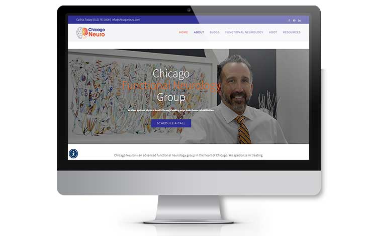
CHALLENGES & APPROACH
One challenge was making their online presence feel as warm and welcoming as their in-person care. Their old website was a little outdated and hard to navigate, so we gave it a full refresh. Now it’s cleaner, easier to use, and makes it simple for people to learn about services or book an appointment. At the same time, we created social media content that focuses on helpful tips, positive messages, and the importance of mental health. Everything we shared was designed to build trust and make people feel comfortable reaching out.
THE RESULT
The feedback has been awesome. Chicago Neuro now has a strong, professional look that matches the quality of their care. Website visits are up, and people are spending more time on the site. Social media videos are getting great engagement, helping build trust with current and future patients.