Category: Portfolio

  • Right Fit Gym

    Right Fit Gym

    MAKING FAMILY FITNESS FUN

    CLIENT: RIGHT FIT GYM


    [embedyt] http://www.youtube.com/embed?layout=gallery&listType=playlist&list=PLcnVCwymgcjkvp1BlR9h79S6QUbYGx6mX[/embedyt]

    OVERVIEW

    Right-Fit Gym is a personal training and group fitness gym founded by Suzanne Gray. It’s all about community, inclusiveness, and results. What started as a single gym has grown into multiple locations—and the team isn’t slowing down anytime soon.

    CHALLENGES & APPROACH

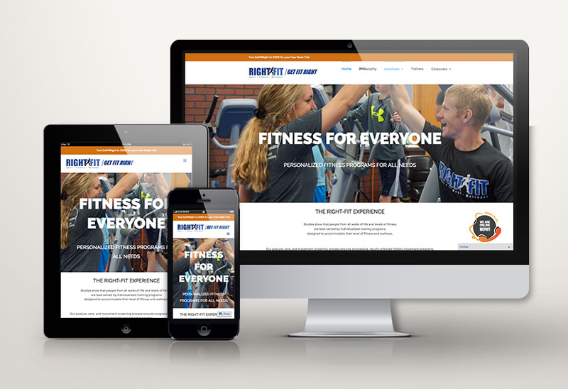
    When Right-Fit opened its second location, they needed a fresh brand identity and a clear marketing strategy—but didn’t have time to hit pause. Like rewiring a plane mid-flight, we had to start making improvements while keeping things moving. Our first step was creating a unified brand voice and look across all digital platforms. From there, we kicked off a content-driven strategy with branded videos, fresh photos, and a new website that feels clean, inviting, and energetic. We also launched regular social media campaigns to boost awareness and get the community excited.

    THE RESULT

    The new website gives Right-Fit a polished online presence that matches the energy of the gym itself. Social media engagement is up, and the branded photo and video content is helping to drive more inquiries and sign-ups. With monthly marketing sprints in place, Right-Fit now has both momentum and a plan for long-term growth. And yes—we’re having a blast doing it!

  • China Ball Tours

    China Ball Tours

    Bringing Basketball Pros to China

    CLIENT: China Ball Tours


    OVERVIEW

    China Ball Tours is a brand-new company bringing international attention to basketball in China. By organizing exciting matches that feature well-known basketball players, the brand aims to put these high-energy games on a global stage—and attract fans, sponsors, and athletes from around the world.

    CHALLENGES & APPROACH

    As a startup, China Ball Tours needed a digital presence that was both eye-catching and functional. The website and social media had to serve multiple roles: showcase games and players, share updates like a news hub, and help attract sponsors and athletes. Our goal was to create a simple, visual-forward design that puts the spotlight on the action. We kicked things off by building a clean, modern website and setting up all key social media platforms. Then we captured powerful photo and video content to bring the story to life.

    THE RESULT

    With strong visuals and storytelling, China Ball Tours is off to a fast and exciting start—building fans, attracting talent, and gaining attention worldwide.


    VISIT China Ball Tours WEBSITE

  • Midwest Performance Gym

    Midwest Performance Gym

    The successful gym that started as an idea

    CLIENT: Midwest Performance Gym


    [embedyt] http://www.youtube.com/embed?layout=gallery&listType=playlist&list=PLcnVCwymgcjmqWGcjXRJH-Qcb6HI9Pgv7[/embedyt]

    OVERVIEW

    Midwest Performance is a women-only gym in the Chicagoland area, built to empower women through fitness, community, and support. It offers a welcoming environment where women of all ages and fitness levels can feel confident and strong. Rage Agency was asked to help build the gym brand from scratch as the gym itself was being conceived of.

    CHALLENGES & APPROACH

    The gym had a great mission and a growing presence in-person, but its brand identity online needed development. The colors, logo, and tone needed to show clearly what the gym stood for at first glance. Our job was to build the brand, build the digital presence, and set the stage for future marketing efforts. We started by finalizing the brand colors and creating the logo for a polished, modern look. Then, we built the website to better reflect the gym’s vibe and mission. We also create all social media channels and applied the new brand visuals consistently. To support growth, we created a set of baseline marketing materials to help with lead generation and promotions.

    THE RESULT

    Midwest Performance now has a strong, unified brand presence that feels powerful, feminine, and clear. With a new website and consistent visuals across all platforms, the gym is ready to grow—and future marketing campaigns already have a solid foundation to build on.


    VISIT Midwest Performance WEBSITE

  • Joliet Bookkeeping

    Joliet Bookkeeping

    Overview

    Joliet Bookkeeping is a new business offering dependable, personalized bookkeeping services tailored to small businesses. With a focus on accuracy, trust, and long-term financial clarity, the company was launched to fill a local need with professional, approachable service.

    Brief

    As a new entrant in a competitive industry, the client needed a full marketing package to establish a strong presence. The goal was to create a brand and website that would stand out visually while clearly communicating the business’s value to small business owners.

    Work

    We developed a complete brand identity, starting with a clean, modern logo and a safe, neutral color palette that reinforced financial professionalism and trust. The website was designed to be user-friendly, mobile-responsive, and focused on clearly communicating the core value proposition: reliable, personalized bookkeeping with small businesses in mind. We also crafted targeted messaging that emphasized clarity, peace of mind, and long-term partnership. Supporting materials included business cards, flyers, and branded social templates to create consistency across all channels.

    Results

    Joliet Bookkeeping launched with a polished and professional image that immediately conveyed expertise and reliability. The brand now has a strong foundation to grow from—and stands out as a trusted partner for local businesses.

  • Action Fabrics

    Action Fabrics


    Overview

    Action Fabrics is a 40-year-old company known for its vibrant fabrics and custom-made athletic apparel, trusted by extreme athletes who need performance and style. With a reputation for quality and creativity, the brand is now evolving under new ownership.

    Challenges & Approach

    After a change in ownership, the company’s business goals shifted—but the website and marketing didn’t reflect the new direction. The new owner wanted a bold, mobile-first strategy that showed off their design skills, attention to detail, and top-notch customer service. The original website was built on WordPress but had major support issues, so we knew a fresh start was the best option. We began with a full brand and website refresh focused on dynamic visuals, clean structure, and flexible design.

    Work

    Using the Avada WordPress theme, we built a modern, mobile-friendly site that better tells Action Fabrics’ story and showcases their one-of-a-kind products. We highlighted their design capabilities, colorful materials, and commitment to customer service. This redesign sets the foundation for future growth and allows the brand to better connect with customers.

    Results

    The new website brings energy, clarity, and professionalism to the brand. With Rage Agency continuing to support ongoing marketing, Action Fabrics is now positioned to reach new audiences and grow its reputation nationwide.

  • Appliance Repairs Chicagoland

    Appliance Repairs Chicagoland

    IN THE SHOP FOR REPAIRS

    CLIENT: Appliance Repairs Chicagoland


    OVERVIEW

    Appliance Repairs Chicagoland is a fast-growing small business serving the suburbs of Chicago. Known for their reliable service and personal touch, they’re helping customers save money—and the environment—by repairing appliances instead of replacing them.

    CHALLENGES & APPROACH

    The team wanted to move from a Facebook only presence and stand out in a competitive market dominated by big box repair stores. Their goal was to highlight the eco-friendly benefits of appliance repair and build a strong local identity. We focused on giving them a fresh, modern look that clearly communicated their values. The branding uses green paired with shades of gray to emphasize sustainability and professionalism. We designed a clean, one-page website that’s mobile-friendly and easy to use. It features online scheduling, live chat, and clear service area listings—making it easy for customers to get help fast.

    THE RESULT

    In addition to the rebrand and new website, we provide ongoing marketing support. This includes print and digital advertising, regular blog content, and strategic updates to help boost visibility in local search results.


    Appliance Repairs Chicagoland now has a strong digital presence that matches their eco-conscious mission. With better branding and easier booking tools, they’re seeing more online leads and growing their customer base across the suburbs.


    VISIT ARC WEBSITE

  • ARDS Foundation

    ARDS Foundation

    Helping all those affected by ARDS

    CLIENT: ARDS Foundation


    OVERVIEW

    The ARDS Foundation is a nonprofit dedicated to helping people affected by Acute Respiratory Distress Syndrome. Through education, support, and advocacy, they provide critical resources for patients, families, and healthcare professionals navigating this serious condition.

    CHALLENGES & APPROACH

    While the foundation had been doing incredible work for years, it needed a refreshed identity and a stronger digital presence to reach more people and expand its impact. The brand and website no longer reflected the energy and urgency of its mission. Our goal was to reintroduce the ARDS Foundation to the public in a way that felt both professional and heartfelt.

    THE RESULT

    To kick things off, we launched a logo design contest to bring fresh ideas into the brand and find a visual identity that captured the foundation’s purpose. Once the new logo was selected, we redesigned the website to better showcase ARDS-related resources, events, and personal stories. The updated site is easy to navigate, mobile-friendly, and puts a strong focus on the Foundation’s causes and community impact.

    The new branding and website have breathed new life into the ARDS Foundation. It’s now easier for people to find support, learn more, and get involved—helping the organization grow its visibility and reach more families in need.


    VISIT ARDS Foundation WEBSITE

  • The Politiker

    The Politiker

    Overview

    The Politiker is a digital campaign marketing company that helps political candidates, campaigns, and local parties connect with voters through smart, professional digital tools. It focuses on providing high-impact marketing services to state and local elections—where support is often limited but the need is great.

    Challenges & Approach

    As a brand-new offering in a traditionally underserved space, The Politiker needed to make a strong first impression. The goal was to create a clear, modern digital identity that would resonate with candidates who want to run smart, professional campaigns without the massive budgets of national races. We aimed for simplicity and strength in the design, combined with flexibility in messaging.

    Work

    We developed a bold, clean website template using a black and white theme with strong red accents to emphasize clarity, urgency, and trust. The logo, a thoughtful blend of elements from the two major U.S. political parties, signals unity and modernity—perfect for a platform that can serve any side. The site is structured to highlight key campaign services like branding, email marketing, digital ads, and voter engagement tools.

    Results

    The Politiker now offers a turnkey platform that empowers candidates to run digital-first campaigns with confidence. It’s professional, accessible, and built to win local attention fast.

  • MilkStop Creative

    MilkStop Creative

    Overview

    MilkStop Creative is an entertainment company focused on supporting the fast-growing community of low-budget filmmakers. Their mission is to empower independent creators by providing a platform for connection, resources, and recognition—helping bring their stories to life.

    Challenges & Approach

    As a brand-new venture, MilkStop needed to carve out a clear identity in the indie film space. The goal was to create a digital home that would appeal to both seasoned creatives and newcomers looking to break into movie-making. It needed to be visually engaging, easy to navigate, and able to grow alongside the community it serves.

    Work

    We designed a sleek, dark-themed website inspired by the look and feel of a modern news magazine. This approach provides a bold yet clean layout to feature short films, filmmaker spotlights, behind-the-scenes content, and creative tools. The site is built to showcase the many layers of the MilkStop community while maintaining a consistent and professional design.

    Results

    MilkStop Creative now has a strong foundation for its mission—a polished, organized platform that gives independent creators a voice and a space to shine. As the site continues to grow, so will its impact in the world of low-budget filmmaking.

  • Gray Hair Management

    Gray Hair Management


    Overview

    Gray Hair Management is an executive outplacement firm that helps senior-level professionals find their next role through proven, strategic job search processes. With decades of experience supporting high-level talent, the company offers practical guidance, resources, and personalized coaching to help executives navigate career transitions with confidence.

    Brief

    The existing website had not been updated in many years and no longer reflected the professionalism or expertise of the firm. It was difficult to navigate, visually outdated, and lacked the digital presence needed to support modern client acquisition. Gray Hair Management engaged Rage Agency to rebrand the business and develop a more effective digital marketing strategy.

    Work

    Rage Agency redesigned the Gray Hair Management website with a clean, modern layout that better communicates the company’s value proposition and services. The new design is mobile-friendly, easy to navigate, and creates a more trustworthy and engaging first impression for potential clients. The visual update is supported by clearer messaging and improved structure, helping visitors find what they need quickly and confidently.

    Results

    The new website positions Gray Hair Management as a contemporary, credible partner for executives in transition. With improved user experience and a stronger digital foundation, the company is now better equipped to support and attract high-level professionals.